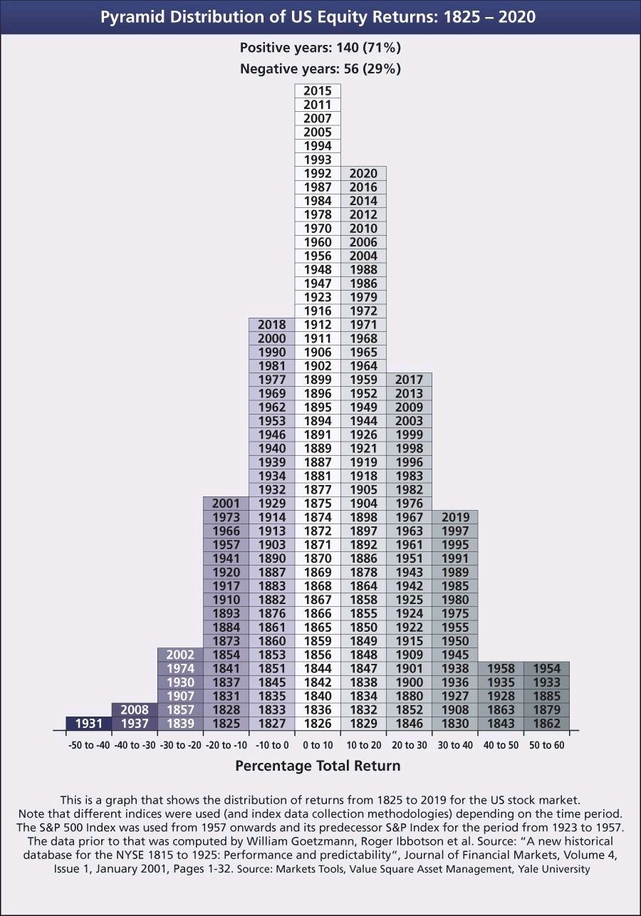
Number of up years since 1825
Chart: returns distribution for each year from 1825-2020
1: Intense deterioration of housing affordability in Canada
The chart below doesn’t show the absolute price-to-income ratio for each G7 country. Instead, it shows the change in the ratio since 2005. One might suggest it is the change in affordability that has the greatest impact on quality of life, population sentiment, personal balance sheets and stability within each country.
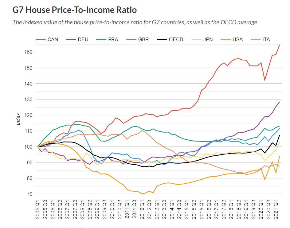
Source: OECD, Better Dwelling
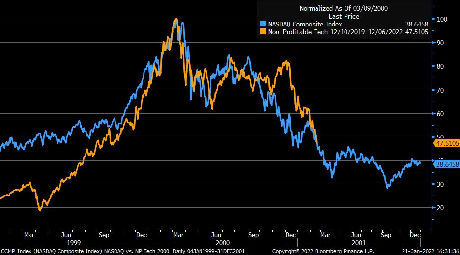
2: The current tech stock journey is following a familiar pattern
I’ll admit that it’s fairly easy to overlay two time periods to manipulate a graph to prove a point. Change the period lengths, start dates or base level and the story could change dramatically. Nevertheless, the chart below compares the current tech runup against that from 1999-2001. Quite similar, based on this example.
3: Between 1825-2020, US stocks had positive returns 71% of the time
The chart below shows the returns distribution for each year from 1825-2020. As you can see, most years saw returns between 0-20% and 71% of years were positive. The stock market is the only ‘casino’ where the odds are stacked in the player’s favour. Yet, emotional reactions often cause people miss out on market returns.