

The 60/40 Portfolio is Dead
The 60/40 Portfolio is Dead
If you use an investment advisor, I'd bet that your portfolio is some derivative of the standard 60/40 allocation. That is, your portfolio is made up of 60% stocks and 40% bonds.
Yeah, you might be +/- 10% here or there and how you fulfill those broad allocations might differ from others, but ultimately most portfolios are pretty much the same. More specifically, most portfolios are exposed to the same general factors.
The 60/40 portfolio has worked fairly well over the past 40 years. After all, the world has experienced a once-in-a-lifetime secular disinflation that provided a tailwind to both stocks and bonds. In addition, the correlation between stocks and bonds generally remained low, helping to reduce volatility along the way.
Unfortunately, the 60/40 portfolio hasn't always worked. The chart below shows the correlations within the 60/40 portfolio going back to 1883. There have been long periods during which stocks and bonds were highly correlated, largely eliminating the diversification benefits of the 60/40 portfolio.

The New Investing Paradigm
The modern asset management industry was built on the underlying assumptions behind the 60/40 portfolio. That's because institutional memory tends to overweight recent history. Unfortunately, the next 40 years might look very different from the last 40 years.
From around 1980 to today, the world has benefited from a secular disinflation created by improvements in computing, communications and global trade. Consequently, inflation and interest rates steadily declined from the double-digit era of the early 1980s.
This long-term decline in rates was like a rising tide for all asset valuations, and provided the economic backdrop for the 60/40 (or similar) asset allocation.
Note: interest rates are a key determining factor when valuing securities. A higher interest rate results in a lower present value of future cash flows - i.e. lower asset prices.
The world is now facing a reversal of some of these trends. Massive monetary expansion, helicopter money and de-globalization are all emerging forces that could push inflation upward. While the last 40 years saw a continued decline in inflation, the next 40 years could see the opposite.
There are no guarantees of course, but this seems like it could be the next 'black swan'. Nobody is expecting inflation. However, it has happened before. The early 1960s to about 1981 was a period of rising inflation and rising rates, as shown in the chart below.

If a long period of rising inflation and interest rates occurs again, both stocks and bonds will face major headwinds.
A Portfolio for a New Investing Era
If the 60/40 portfolio is dead, what else could investors do? Below I will examine four model portfolios using data (sourced from PortfolioCharts.com) going back to 1970 to see what allocation can withstand both investing eras:
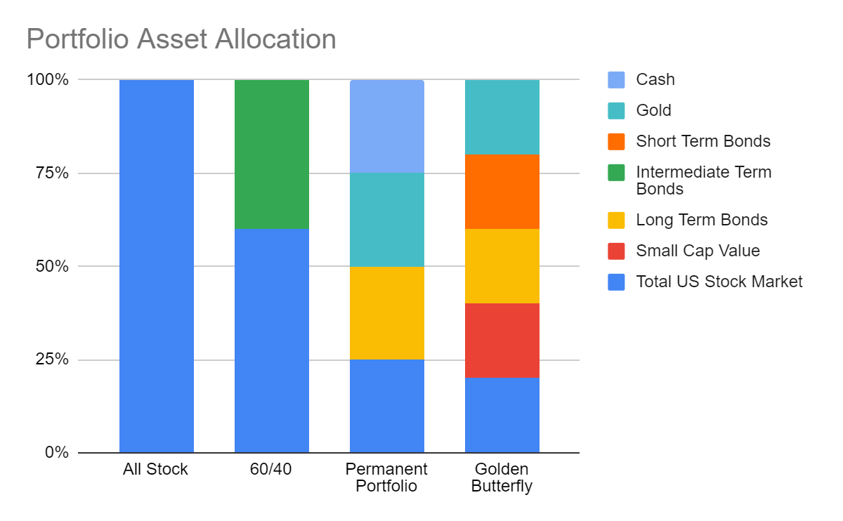
1. All Stock Portfolio
As the name suggests, this portfolio is made of 100% US stocks. Aggressive? Yes. But many people under 30 run portfolios that are nearly all stocks.
2. Traditional 60/40 Portfolio
First proposed by John Bogle, this portfolio splits allocation between the total US equity market and intermediate bonds. While precise allocations and fulfillment methodologies may differ, the risk-return characteristics of most modern portfolios generally align with this model - don't let all the bells and whistles fool you.
3. Permanent Portfolio
This portfolio was first proposed by investment advisor Harry Browne as a way to provide stability throughout economic cycles. To do this, he included growth stocks, precious metals, government bonds, and Treasury bills.
This is the first of the portfolios examined that goes beyond the traditional, potentially providing stability and growth in a new investing era.
4. Golden Butterfly Portfolio
Like the Permanent Portfolio, this portfolio is meant to perform well during all investing environments. This portfolio has the higher returns associated with the All Stock Portfolio, but the lower risk levels associated with the Permanent Portfolio.
The chart below summarizes the broad asset allocation for each of the four portfolios. Note, these are just models - guidelines investors might use when constructing their own ideal asset allocation.
The Risk Experience
Despite what you might have heard, investing isn't just about chasing returns. First and foremost, investing is about managing risk. What risks? The risk of losing money, the risk of losing purchasing power, the risk of making mistakes caused by an emotional response to volatility.
An investment with high long-term average returns is pointless if investors sell every time markets decline by 20%. Unfortunately, it is extremely difficult to manage human emotional responses to market gyrations. So portfolios should be constructed to accommodate these emotions. That means, investors crave more stable portfolios that lose money less frequently and have shallower drawdowns when they do lose money. The first chart below shows this data for the four portfolios, with the Golden Butterfly Portfolio as the clear winner.
The second chart shows the longest time to recovery each of the portfolios ever experienced. Can you imagine being underwater for 13 years? That was the longest recovery for the All Stock Portfolio. Shockingly, the 60/40 portfolio's longest period to recovery was a whopping 12 years!


Portfolio Returns
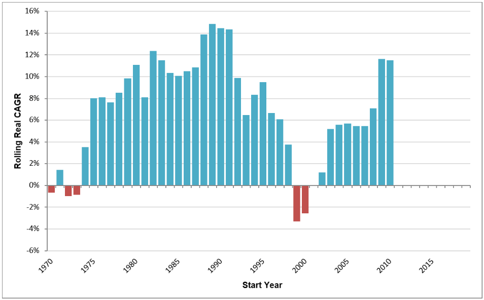
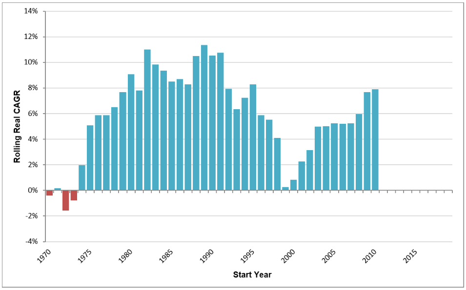
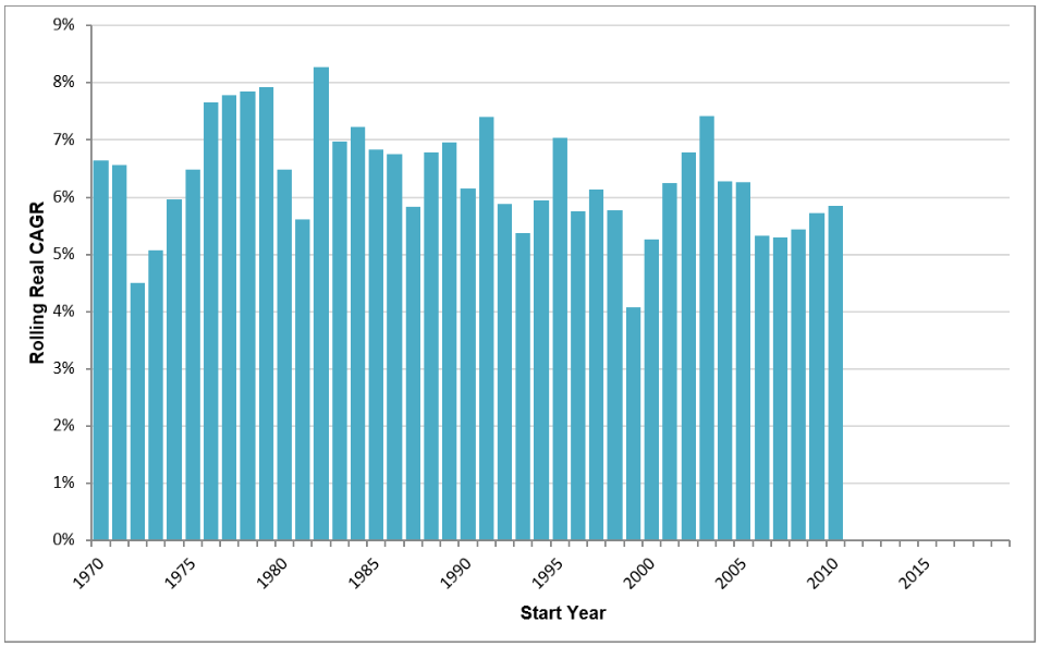
The four charts below show the rolling 10yr forward returns for each of the portfolios going back to 1970. For example, this means that the bar over 1980 shows the 10yr return an investor would have experienced if they invested from 1980-1990.
What becomes clear by looking at these charts is that the All Stock and 60/40 Portfolios break down in certain environments. In contrast, the Permanent and Golden Butterfly Portfolios provide a much more consistent experience across investing eras.
All Stock Portfolio
60/40 Portfolio
Permanent Portfolio

Golden Butterfly Portfolio
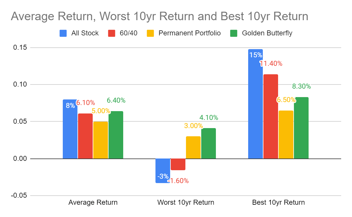
The following chart encapsulates the entire data set into a single average, worst and best return figure. While the Golden Butterfly Portfolio average return is 1.6% (160 basis points) below the All Stock Portfolio, it provides a much more stable experience. Indeed, the Golden Butterfly Portfolio's worst 10yr return was POSITIVE 4.1%. It is much easier to manage emotions when that's the worst case experience.
Moving Forward
Remember, the portfolio data above encompasses two distinct investing eras. The point is to show what might work across different eras, not what worked only during the disinflationary era of the past 40 years.
The Permanent and Golden Butterfly Portfolios performed well across eras because of their allocation to gold.
Gold's investment characteristics are very different from traditional assets like stocks and bonds. In particular, gold tends to outperform during periods in which stocks and bonds underperform. This is important as the world enters a new investing era that may not be favourable to the standard 60/40 portfolio.